


WEBTOON Gets a Facelift
Add witty subtitle here.

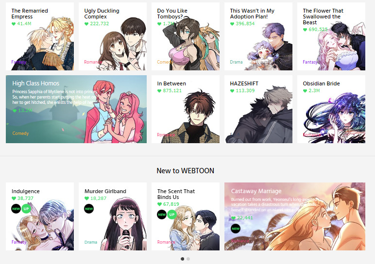
WEBTOON just updated site design.
It might sound like a small change, but it’s a significant step in one very specific direction. More than anything it cements the strategy WEBTOON will be carrying on for the foreseeable future.
Let’s unpack.

Webtoon Platform Strategy 101
So, what exactly did they change?
Well, everything.
WEBTOON was one of the few overseas platforms that hasn’t shifted their front page significantly in the past four years. Yes, there have been adjustments here and there, but nothing massive like what we’re seeing now.

Previously, WEBTOON used the “hero banner” to highlight featured titles while also promoting their Canvas and WEBTOON app for mobile users. This is similar to other webtoon platforms like Lezhin, Manta, and Tapas, all of whom use some form of the hero banner to highlight titles on their front pages.

While Manta and Lezhin currently use a three-banner motif, Tapas still uses a single main banner (like WEBTOON did), to highlight single titles or large promotions. Beneath the hero banner, we had the “fold” which leads to smaller icons highlighting secondary titles.
Every platform has some variation of this and they range from sections highlighting Trending, New, or Promotions. During my time at Lezhin, we had four significant changes to the front page ranging from the hero banner to how new releases were displayed.
Each one required weeks of meetings, at least a month of coding, and then follow-up meetings where secondary teams were brought on to give their opinions.
During that time, WEBTOONs made two or three changes to their homepage. One, they added a few new ad slots. And two, they added two permanent spots highlighting Canvas and their mobile apps.
What’s Wrong with That?
Before I get into this, I want to reiterate that I’m not giving away any secrets here. Everyone who works, worked or even reads webtoon platforms extensively can immediately understand the weakness of this front-page strategy.
Exposure.
At best, you’re highlighting 5 titles on the front page on a first viewing. Usually, you’re only getting 2 or 3. For users to see more, they have to scroll past the fold at which point you’ve already lost half of your incoming traffic.
This is the reason that companies have transitioned to the three-banner format, just to increase exposure on the front page without losing the “hero banner” slot.
The same is true for the vast majority of Korean platforms as well. That’s why Lezhin’s Korean platform uses the same three-banner format while other companies like RIDI use a variation of it.
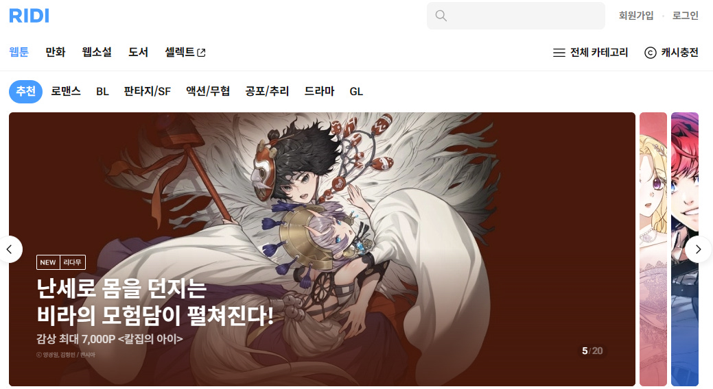
But, the goal for each platform is the same. They want visitors to be exposed to as many webtoon titles as possible when they visit a platform’s front page. KakaoPage has a great example of this using a three-banner hero with a sub-banner section right below it.

It’s a bit busy, but the overall design is still pleasing to look at. And, in my opinion, KakaoPage’s design is probably the most balanced in Korea as far as aesthetics are concerned. Compared to them, many other designs feel cluttered or overly empty.
But… there is one other company who has a unique design. One company who eschews aesthetics and goes straight for practicality, maximizing the number of webtoon titles on the front page.
Old is New
Here’s a quick comparison of the new WEBTOON front page and the longstanding Korean Naver Webtoon front page.
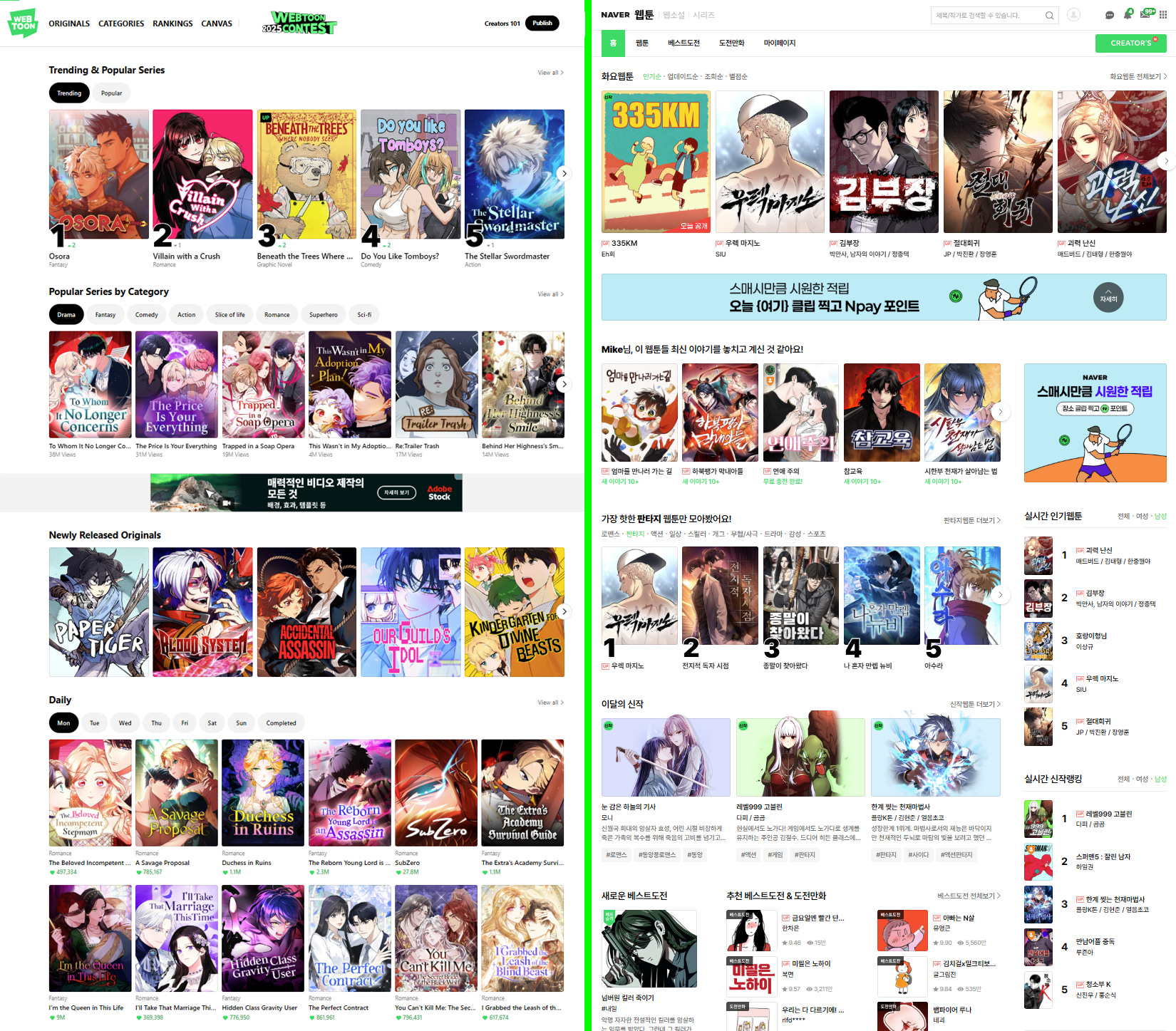
Twins separated at birth, am I right?
Webtoon platforms in Korea host thousands of titles from original Korean webtoons to Japanese manga to overseas comics. In many cases, the number balloon further to the tens of thousands.
Naver Webtoon’s front was designed to show the maximum number of webtoon titles without being overwhelming to the viewer. That’s why there are multiple lists, highlighted sections and format changes to make each section easily recognizable.
It might be a jarring change for WEBTOON readers, but the UI is focused on exposure above all else.
What Does This Mean?
The difference in front pages always signaled to me the understanding that WEBTOON was not the same as (Naver) Webtoon. Not necessarily the cultural differences, but the difference in audience maturity.
Naver Webtoon is the market leader in Korea, but they exist inside of a thriving digital content ecosystem where new titles are discussed on blogs, chats and videos. Every day, new creators start writing new stories and potential creators attend classes at a variety of private and government-sponsored programs. 도전만화 (Korea’s version of Canvas) is a thriving place on its own with a wealth of content.

About a week ago, I mentioned that WEBTOON was entering a new phase of their content strategy. The publication of more non-Korean content as well as the inclusion of non-exclusive content is out of character for WEBTOON US, but completely in line with Naver Webtoon’s content strategy in East Asia.
WEBTOON is betting that the overseas webtoon market has matured since the closure of Piccoma Europe as well as other ventures that sought to copy-paste East Asian content strategies in western markets. Or they’re betting that their specific strategy is applicable outside of their homecourt.
And there’s a lot going for them. Unlike their contemporaries, WEBTOON is still thriving in overseas markets. More specifically, WEBTOON is actively chasing down book deals, merch licensing, drama-adaptaions and anime adaptations. Based on audience responses, it’s been quite successful. Suffice it to say, WEBTOON is at the top of their game.
But they are still fighting against traditional publishing structure and slow-adoption rate in Europe to their digital-first strategy. Not to mention the print market is still dominated by manga.
While their strategy is a strong one, it’s still a gamble. And time will tell whether it’s enough.